Super Deep Studios
Super Deep Studios is a women-led team of design innovators specializing in Insights and Service Design. They focus on people and finding equitable solutions that help shift structures and systems toward a regenerative and just future.
It was my honor to work alongside such gifted, compassionate, and innovative women.
Challenge to overcome
Break down the barrier between the people Super Deep has gotten to know outside of the organization and the people they work with inside the organization.
How might we democratize insights to build a database of quotes, stories, and media that will be accessible by cross-functional teams within an organization?
One way to democratize insights is to use a cloud-based, collaborative platform that integrates with Google Drive or Microsoft OneDrive. This would allow team members to easily share and access documents, videos, images, and other types of media.
Keeping in mind the scope of the project and the goal of giving a voice to the marginalized communities being served by organizations, we needed to create a safe space for connection. Together with SVPs, we workshopped multiple user routes and journeys.
Break down silos
Measurements for success
Imagine the possibility of large-scale organizations being able to access a library of quotes, artifacts, and stories to listen to what their consumers are feeling, thinking, and discover who they really are.
The project owner and I used the following objectives throughout the project to measure success:
>> Bring users into the boardroom through extensive research
>> Motivate to restructure systems
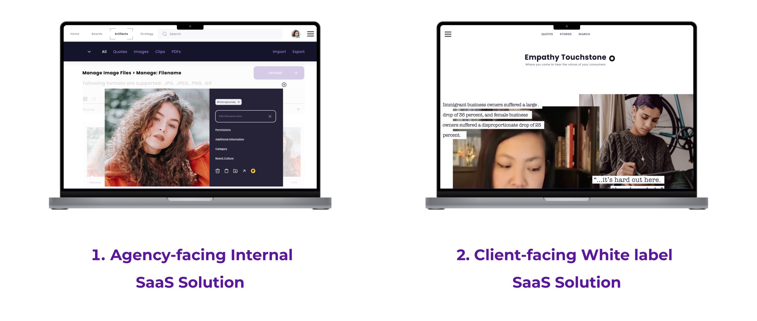
>> Create a product that is both agency-facing and client-facing
User research is synthesized
Key Insights
Multiple key feature opportunities were discovered during testing. We need to rework and rethink the layout of the notes functionality. This feature was well-received throughout testing, offering the internal team a way to communicate to future readers.
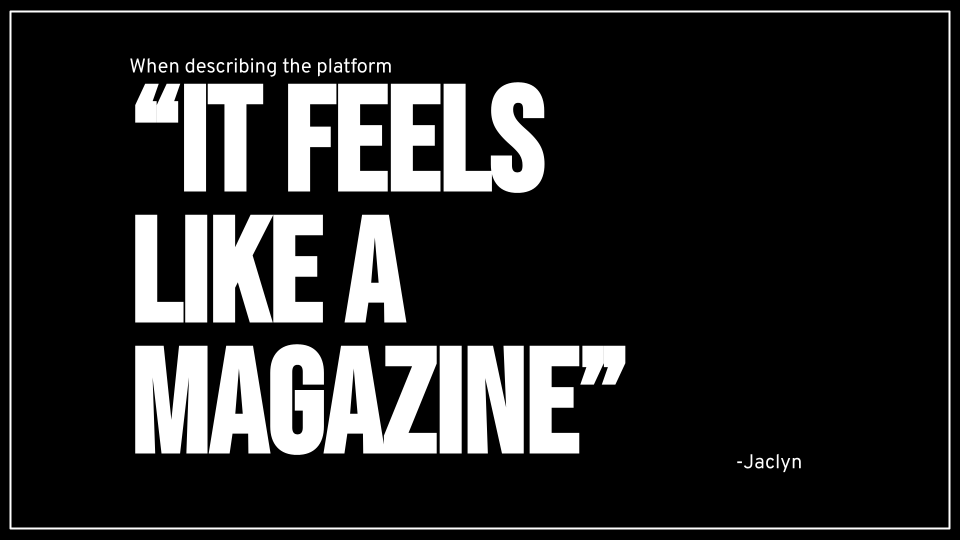
When asked about the overall tone of the platform, one user suggested that “we make the database more human.” The information needed to be presented using the participants' voices and perspectives in order to authentically inspire readers. Our solution for this was to create the design layout modeled after publications commonly used by the team.
Participants included a Product Manager, an Insights Director, a Service Designer, and 2 Strategic Leader/VPs. I interviewed 3 client-facing users and 2 agency-facing users. I wanted to hear from both sides of the platform to discover new opportunities for growth. By interviewing 5 users, I am able to discover roughly 80% of the issues that exist across the user base.
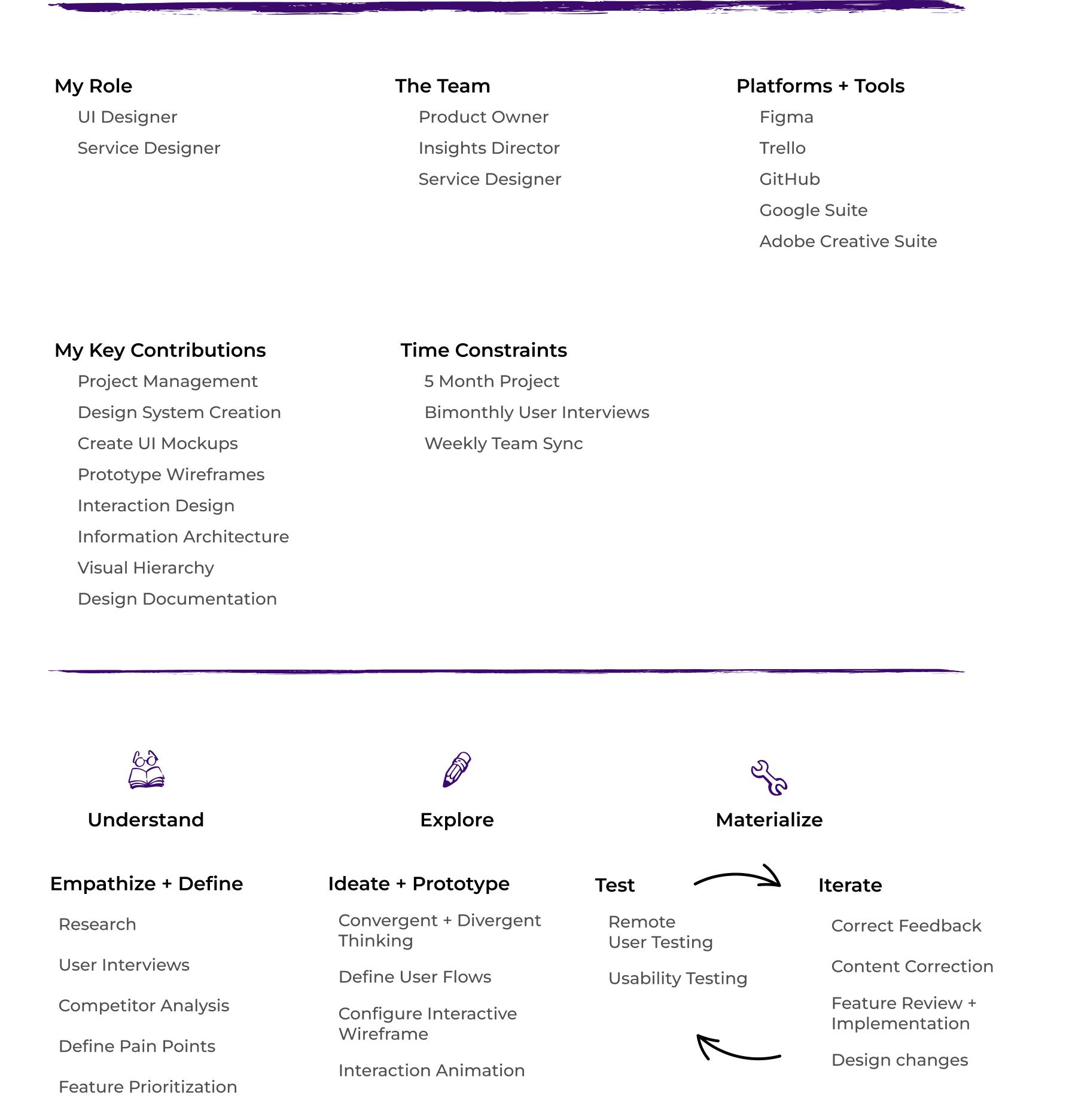
The usability tests were administered remotely over ZOOM using Maze as a testing platform and Figma as the prototype building tool.
Key Takeaway #1 - Client facing
Clients want easy, quick access to stories
Large photos with story headlines are laid out in an editorial style earned top marks during user testing
Key Takeaway #2 - Client facing
Clients were inspired to revisit the insights work more often
Users found the information architecture to be intuitive and helpful, inspiring them to stay longer and dig deeper into their campaigns
Key Takeaway #3 - Agency facing
Users want to be able to bulk upload data
Internally, the research team needed to edit multiple assets as well as a bulk upload option for the different types of media gathered during the campaign
Map it out
Prototype Buildout
Using our initial user data, we got to work building out sketches that would evolve into powerful, interactive prototypes. We knew that we needed to approach this problem using two independent product solutions: 1. client-facing; and 2. agency-facing.
Break the product to see if it works
User testing
First click testing led to iterating on the initial point of confusion many users were having with the platform: the placement of the navigation bar. Utilizing card sorting, we were able to comprehend the user's vocabulary and create naming conventions based on this feedback.
Additionally, opportunities for improvement around the homepage, information architecture, and search functionalities were discovered and iterated upon.
Correction #1
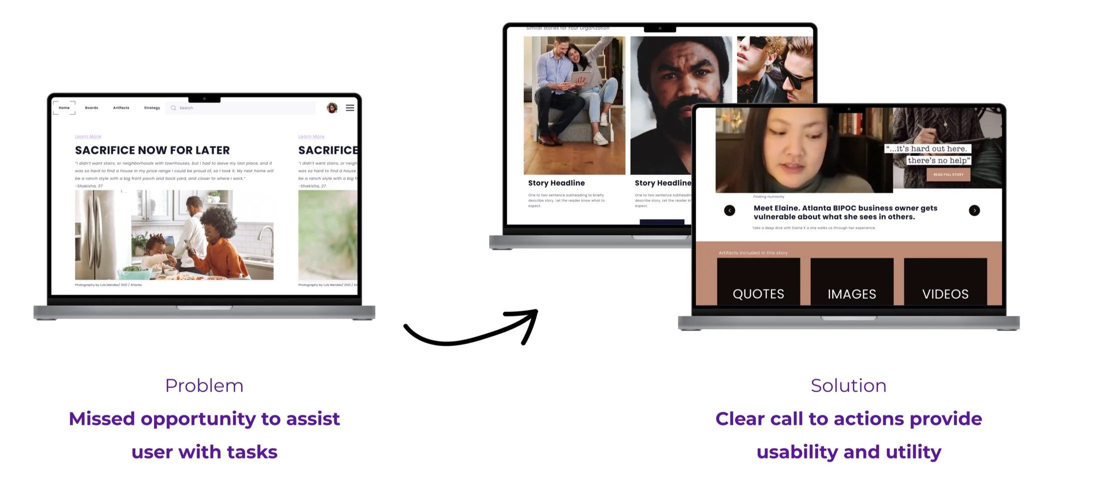
Optimize landing page utility
The original landing page design was lacking to communicate its value clearly to the user, causing confusion and loss of use.
Solution: Utilize editorial layout to present data as humanly as possible with clear calls to action.
Correction #2
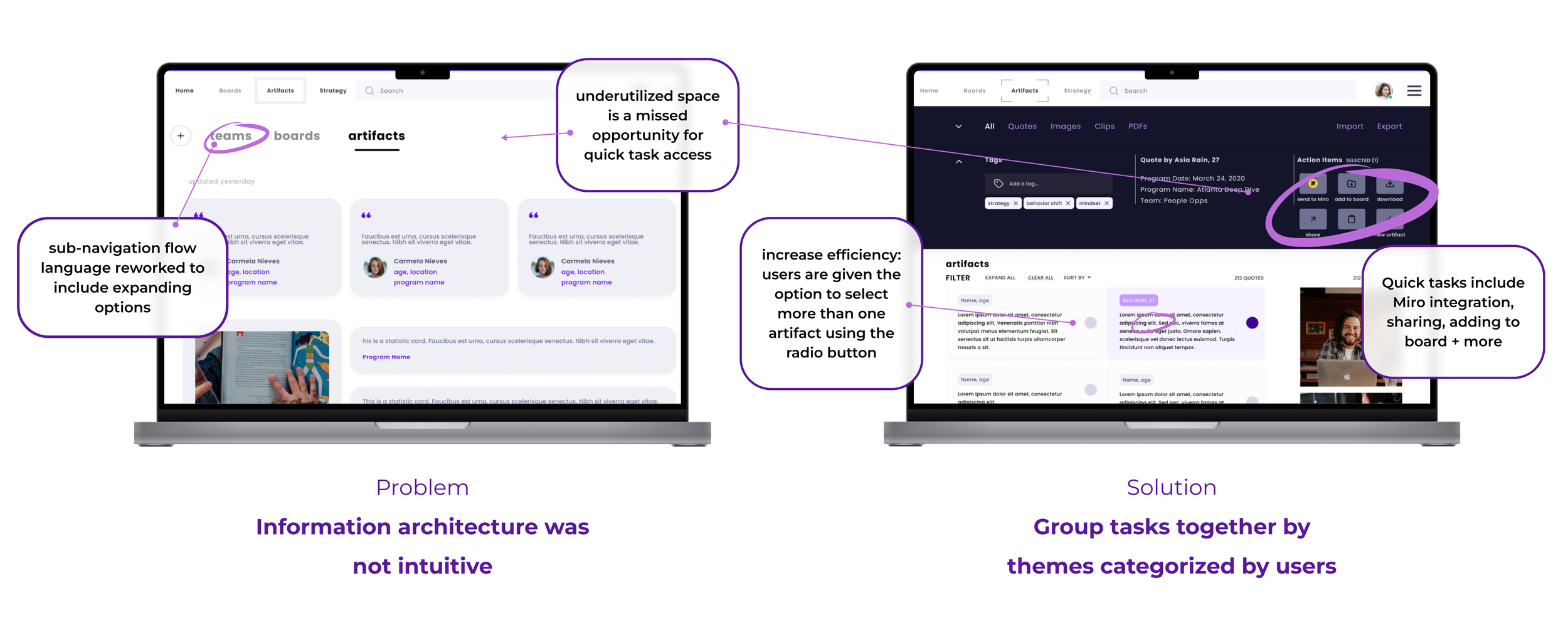
Understand the information architecture
When given the option of looking through a broader search or individual stories, 75% of users overlooked the artifacts page completely.
Solution: Minimize confusion by reconfiguring the necessary categories and utilizing real estate.
Correction #3
Simplify search feature
As the core function, the search feature needed to be robust, however not confusing. User testing showed that giving the user too many options actually caused more confusion and led to misclicks and frustration.
Solution: Dynamic search fields that display results while the user inputs text. Real-time feedback is displayed, and confusion is minimized.
The Results
Interactive prototype
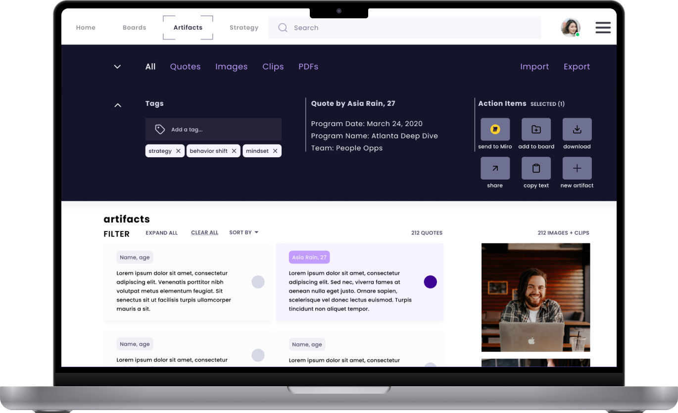
As a result of this project, two versions of an interactive prototype (agency-facing and client-facing) were created. A database that communicates in the style of a leisurely weekend magazine, but with the power of smart asset management and insight tracking. The gap between organizations, teams, and customers has narrowed.
Accessing Data
Real stories + artifacts available within seconds
Organizations that participated in our user research prioritized quotes, images, and videos as the top categories required from their research studies.
Data + Asset Democratization
Improving cross-functional team communication
Task-oriented action items enable agency-facing users to export or download data quickly, share campaigns or individual artifacts with other departments, teammates, and even create new boards to organize insights.
Closing Remarks
A classy and powerful tool
Returning to our initial “How Might We” approach to the problem, How might we democratize insights to build a database of quotes, stories, and media that will be accessible by cross-functional teams within an organization? I think we succeeded in our objective of creating a platform that helps the organization understand and empathize with its consumers in order to better structure systems.
Looking to the future
Incorporating AI-tagging functionality for uploading artifacts, narratives, and quotes will speed up the process of onboarding new campaigns for researchers. Voice notes and dictation are yet another potential future addition.
1. Client-facing prioritized features include: editorial visual display, board creation, robust search
2. Agency-facing features include: bulk asset upload, note-taking, third-party integration
Wireframe: low-fidelity wireframes for the client-facing first round of user testing
Draw it out: initial sketches layout the first iteration of the quotes library
Wireframe: high-fidelity wireframes show the artifact upload screen
Draw it out: initial sketches describe three routes to upload assets
Landing Page Evolution
The landing page needed to be interesting, intuitive, and useful to keep users eager to learn more about their users. We maintained a focus on the tension between customer relationship management software and journalistic storytelling.
The layout needed to communicate it’s value to the users by intuitively providing data in a captivating format. The initial high-fidelity attempt gave a voice to the story, but it lacked the necessary utility for the teams to share, download, or integrate with third-party platforms.
In the third iteration, access to quick tasks is available by clicking on the icons just below the header and body text in the hero section of the landing page.
