Project Overview
The Barber Lounge, a well-established grooming and lifestyle brand, approached me with a clear objective: to revitalize their online presence. Their existing website, though functional, was outdated and lacked the visual appeal and user engagement necessary to compete in today’s digital landscape. The brand's identity, rooted in tradition and community, needed to be reflected in a more modern and dynamic online experience.
The primary goals of the redesign were threefold:
Improve User Experience: The original website's structure was linear and offered limited interaction, leading to a less engaging user journey. The new design needed to create a seamless and immersive experience that would keep users on the site longer and encourage exploration.
Modernize the Brand: While the Barber Lounge had a strong offline presence, their online platform did not adequately reflect the brand's contemporary and professional image. The redesign aimed to align the website’s aesthetics with the brand’s identity, creating a modern and visually appealing digital storefront.
Increase Customer Engagement: The website's previous iteration had underutilized calls to action and a lack of interactive elements. The redesign sought to strategically place and highlight CTAs, enhance content flow, and use compelling visuals to boost user interaction and drive conversions, such as booking appointments and purchasing products.
The updated layout effectively reflects the brand's vibrant culture and commitment to excellence, providing a more engaging and user-friendly experience for visitors.
My Role
As the lead Web Designer and UX/UI Designer for the Barber Lounge project, I was responsible for driving the entire design overhaul from start to finish. My role encompassed every phase of the project, including:
Research & Planning: I conducted a thorough analysis of the existing website, identified key areas for improvement, and aligned the redesign goals with the client’s vision and brand identity. I also analyzed competitors and gathered insights to inform the new design direction.
User Experience (UX) Design: I restructured the website’s content and navigation to enhance usability and create a more engaging user journey. This involved developing wireframes and prototypes that laid out the new layout, ensuring a seamless and intuitive experience across all devices.
User Interface (UI) Design: I led the visual design process, selecting a modern color palette, typography, and imagery that reflected the brand’s identity. I also designed the final user interface, focusing on creating a visually appealing and cohesive aesthetic that aligned with the Barber Lounge’s values.
Design Execution & Delivery: I collaborated closely with developers to bring the design to life, ensuring that every detail was implemented accurately. I provided guidance on responsive design principles to optimize the site for various devices and screen sizes.
Throughout the project, I maintained regular communication with the client to ensure that their needs and expectations were met, ultimately delivering a website that not only fulfilled the project goals but also exceeded the client’s expectations.
This FigJam file outlines the project details, including user demographics, goals, and design strategies that guided the Barber Lounge website redesign. The visual planning in FigJam ensured a clear alignment with the client’s vision and the successful execution of the project.
Problem Statement
Challenges with the Original Design
The original Barber Lounge website faced several critical challenges that hindered its effectiveness as a digital platform:
Outdated Visual Design: The website's design was dated, featuring a traditional layout with boxed sections and a dark, muted color palette. This not only made the site look less appealing but also failed to reflect the vibrant and modern personality of the Barber Lounge brand.
Lack of Engagement: The site had minimal interactive elements and a linear content structure that did not encourage users to explore beyond the basic information. This resulted in a low level of user engagement, with visitors often leaving the site without taking any meaningful actions.
Poor Content Structure: The content was compartmentalized into distinct, disconnected sections, making it difficult for users to find the information they were looking for. The lack of a coherent content flow meant that users were not guided through the site in a way that would lead to higher engagement or conversion.
Ineffective CTAs: The call-to-action (CTA) buttons on the site were not prominent and often blended into the design, reducing their effectiveness. Users were not clearly directed to key actions such as booking appointments or purchasing products, leading to missed opportunities for conversion.
Client’s Objectives
In response to these challenges, the client outlined several key objectives for the redesign:
Create a Modern Aesthetic: The client wanted the website to reflect the Barber Lounge’s contemporary and professional image. The goal was to modernize the visual design with a clean, sophisticated aesthetic that would appeal to both current and potential customers.
Improve User Navigation: Enhancing the site’s usability was a top priority. The client wanted a more intuitive navigation structure that would make it easier for users to find information, explore services, and engage with the brand.
Increase Conversion Rates: The client was particularly concerned with improving the effectiveness of the website in driving conversions. This included better placement and design of CTAs to encourage users to book appointments, join memberships, and purchase products directly from the site.
Enhance Brand Identity: The redesign needed to showcase the unique personality of the Barber Lounge, emphasizing its community roots, diverse team, and commitment to excellence. The client wanted the website to serve as a true digital reflection of the brand’s values and culture.
The original homepage of the Barber Lounge website featured a dated design with a dark color scheme, lacking the visual appeal needed to represent the brand's vibrant personality.
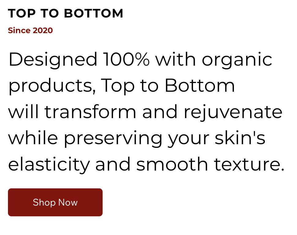
The original "Join Us" and "Product" sections of the Barber Lounge website were text-heavy and visually unengaging, contributing to a poor user experience and lower conversion rates.
Research
Audience Analysis
The target audience for the Barber Lounge is diverse, reflecting a broad range of demographics and lifestyles. Here’s a breakdown based on the user demographics:
Age Range: The primary age range for the Barber Lounge’s clientele is between 20-40 years old. This includes both families and single individuals, indicating a wide appeal across different life stages.
Gender: There is a good split in gender, suggesting that the services cater to both men and women equally, though the emphasis may still lean towards traditional barber services for men.
Location: Many clients are from out of town, particularly due to navy transfers, indicating that the Barber Lounge serves a significant number of military personnel. There are fewer local customers, highlighting an opportunity to strengthen the connection with the local community.
Occupation & Lifestyle: The audience primarily consists of military personnel, students, and blue-collar workers. With the presence of new carriers and piers, as well as military contracts, the area sees a lot of movement and diversity. Additionally, the clientele includes professionals working in tech and logistics, such as those employed by Amazon (not warehouse roles), Google, and other tech companies. This variety in occupation suggests a need for flexible and convenient service offerings.
Cultural Background: The Barber Lounge is rooted in Black barber shop culture, which is a significant aspect of its all-inclusive identity. This cultural background not only shapes the atmosphere of the lounge but also attracts clients who resonate with its traditions and community-focused approach. Despite its cultural roots, the Barber Lounge boasts a fully diverse clientele that includes all races, reflecting its commitment to inclusivity and welcoming environment.
Frequency of Visits: The frequency of visits is high, indicating that clients view the Barber Lounge as a trusted and regular part of their grooming routine. This loyalty is a strong foundation for further engagement and brand development.
The project goals outlined in this FigJam file helped guide the redesign process, ensuring that each objective was met effectively.
Design Process
Visual Design
With the wireframes and prototypes finalized, the next step was to bring the Barber Lounge’s brand to life through visual design. The key design decisions focused on creating a modern, inviting aesthetic that reflected the brand’s identity.
Color Palette: The color palette was carefully selected to balance tradition and modernity. I opted for a clean black and white base, which added sophistication and allowed the vibrant photography to stand out. Accents of deep reds and browns were used to evoke warmth and professionalism, aligning with the brand's image as a premium grooming destination.
Typography: I chose bold, modern fonts for the headings to create a strong visual hierarchy and improve readability. The font selections were intended to convey both confidence and approachability, resonating with the Barber Lounge’s diverse clientele. A more neutral, legible font was used for body text to ensure that content was easy to read across all devices.
Imagery: High-quality, black-and-white photography was a focal point of the new design, used to showcase the team members and the unique atmosphere of the Barber Lounge. These images were chosen to reflect the brand’s roots in Black barber shop culture while also appealing to a broader, diverse audience.
Layout: The layout was designed to be dynamic and visually engaging, with large, full-width sections that guided users through the site. This approach helped to create an immersive experience that mirrored the
in-person environment of the Barber Lounge.
Utilizing the Wix CMS
The Barber Lounge had already established their online presence using Wix, a platform they were familiar with and wanted to continue using. My approach centered around optimizing the existing Wix CMS (Content Management System) to deliver a modern and engaging website that met the client’s needs without the need for complex wireframing or prototyping.
Customization within Wix: Instead of starting from scratch with wireframes or prototypes, I focused on customizing the existing Wix templates to align with the Barber Lounge’s brand identity. I leveraged Wix’s design tools to create a layout that was both visually appealing and functional, ensuring that the content was organized in a way that enhanced user experience.
Content Management: I streamlined the content within the Wix CMS, making it easier for the client to manage and update the site in the future. This included organizing text, images, and other media into sections that were intuitive and aligned with the site’s overall design. The use of Wix’s drag-and-drop functionality allowed for efficient design updates and ensured that the final website was both user-friendly and easy for the client to maintain.
Responsive Design: I also took advantage of Wix’s built-in responsiveness features to ensure that the site looked great on all devices, from desktops to mobile phones. This was crucial in providing a consistent user experience across various platforms, catering to the diverse audience of the Barber Lounge.
Fun fact - I did all the photography for this project as well. :)
The bold typography used in the redesign enhances readability and helps create a strong visual hierarchy, guiding users through the content with ease.
The Wix CMS dashboard, where content and design were managed, allowed for efficient updates and ensured the final website was easy for the client to maintain.
Final Design & Outcome
Visual Comparison
The transformation of the Barber Lounge website is best illustrated through a direct visual comparison of the "before" and "after" designs:
Before: The original website featured a traditional, somewhat outdated layout with a dark color scheme, minimal imagery, and a linear content structure. It lacked visual engagement and failed to effectively convey the brand's modern, vibrant personality.
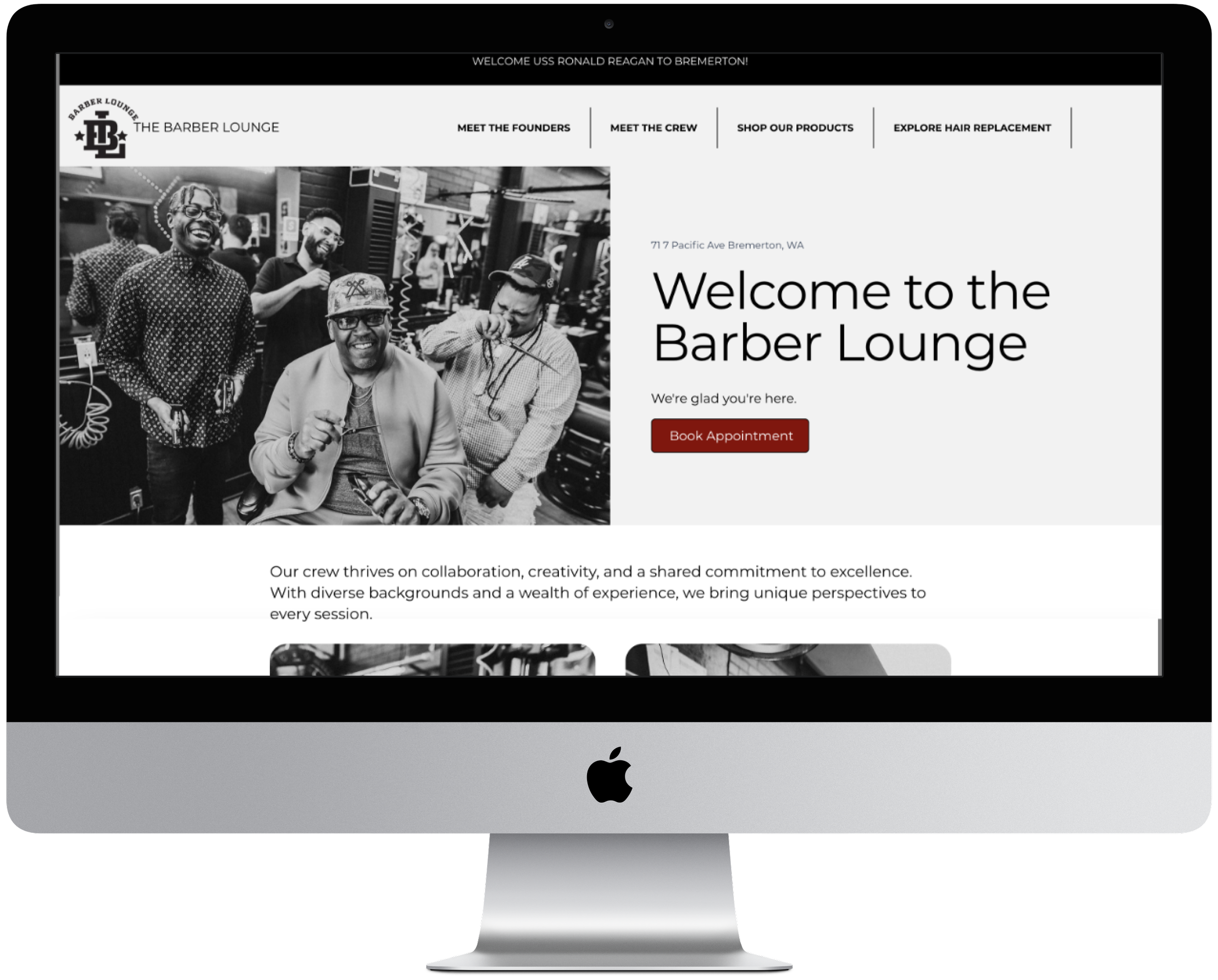
After: The redesigned website boasts a clean, modern aesthetic with a dynamic layout, enhanced by bold imagery and a cohesive color palette. The new design aligns closely with the Barber Lounge’s brand identity, reflecting its roots in Black barber shop culture while appealing to a diverse audience. The improved content flow, along with strategically placed call-to-actions, has created a more engaging and user-friendly experience.
The original design featured a dark-themed homepage with minimal imagery, a basic call-to-action, and significant wasted space, resulting in a dull and uninviting user experience.
The updated homepage maximizes space with vibrant imagery and impactful content, creating a welcoming atmosphere that better reflects the Barber Lounge’s brand and engages visitors effectively.
Reflection
Lessons Learned
Throughout the Barber Lounge website redesign project, several key challenges arose that provided valuable learning experiences:
Working Within Platform Constraints: One of the primary challenges was working within the limitations of the Wix platform. While Wix offers user-friendly tools, it also has constraints that can limit design flexibility. Overcoming this challenge required creativity in using the available tools and finding alternative solutions to achieve the desired design outcomes. This experience reinforced the importance of adaptability and problem-solving when working within predefined constraints.
Balancing Client Preferences with Best Practices: The client’s preference for continuing with Wix meant that certain advanced design and development techniques had to be adapted or simplified. Ensuring that the final product met both the client’s expectations and industry best practices was a delicate balance. This taught me the importance of clear communication and setting realistic expectations while still striving to deliver a high-quality product.
Emphasizing User Experience: Another insight gained was the significance of user-centered design, especially in a service-oriented business like the Barber Lounge. The positive feedback from users highlighted how crucial it is to prioritize ease of use, visual appeal, and functionality. This project reaffirmed my commitment to always considering the end-user's needs and preferences in any design work.
The Wix dashboard played a crucial role in managing the content and design elements during the Barber Lounge website redesign, allowing for efficient updates and customization within the platform's constraints.


